
Conquer - A Design ThesIS
Client Background
During my third year of design school, I completed a year-long capstone project focused on identifying a real-world issue and developing a design driven solution. Drawing from both personal experience as a childhood cancer survivor and my volunteer work with Camp Quality Southern Ontario, I created an app concept called CONQUER, designed to support families affected by childhood cancer.
The app is built around three core pillars: Connect, Conquer, and Learn. Connect enables families facing similar challenges to build supportive relationships with one another. Conquer provides a direct, accessible way to communicate non-emergency questions to a child’s cancer care team. Learn offers a centralized hub of verified, research-based information covering a wide range of childhood cancers.
Strategy & Outcome
The overall brand identity for CONQUER was designed to feel both calming and quietly defiant, reflecting the resilience of the families it serves. A bold navy and gold colour palette was chosen, with gold representing the ribbon for childhood cancer awareness. The typography features clean, welcoming sans-serif typefaces optimized for digital accessibility. Visually, the brand avoids depicting children in treatment, instead using symbolic elements such as mountains to represent strength and perseverance, alongside scientific imagery within the Learn section to reinforce credibility and trust.
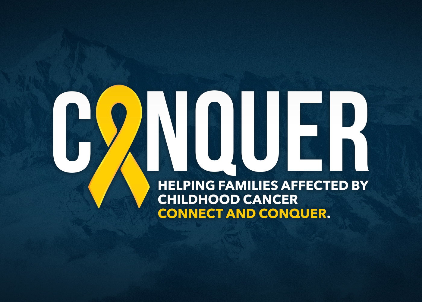
Logo design for "CONQUER".
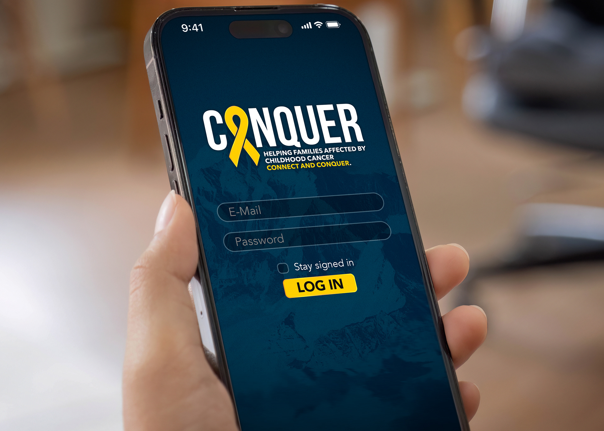
Log in screen for "CONQUER".
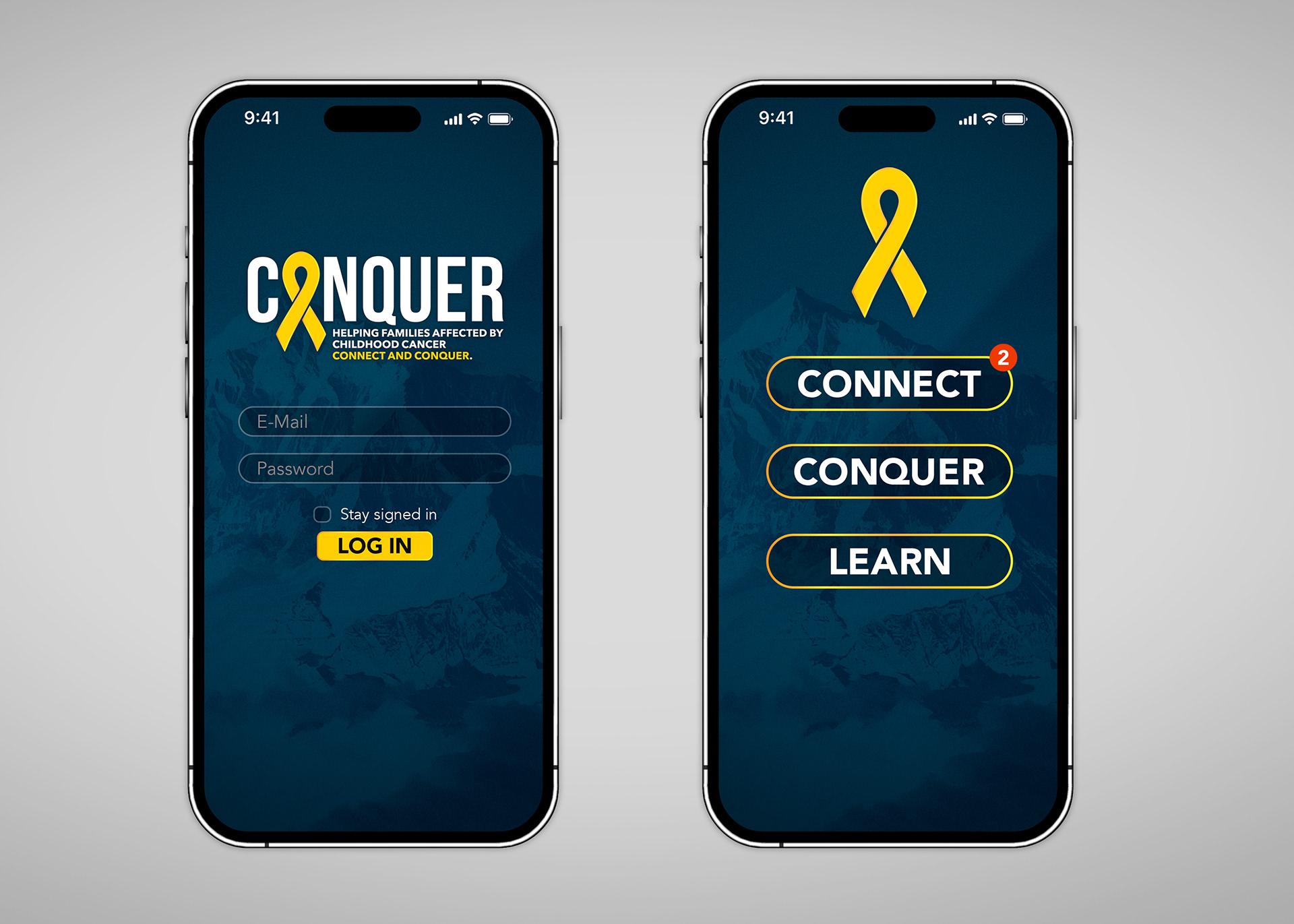
Log in screen, and landing screen featuring the three pillars this concept was built upon.
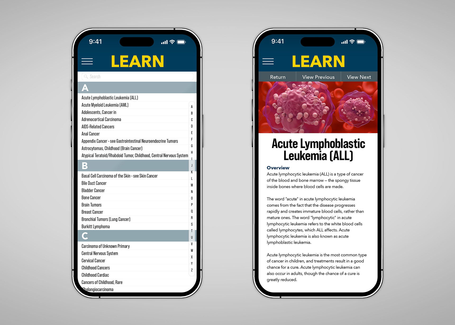
List of cancers and information page.