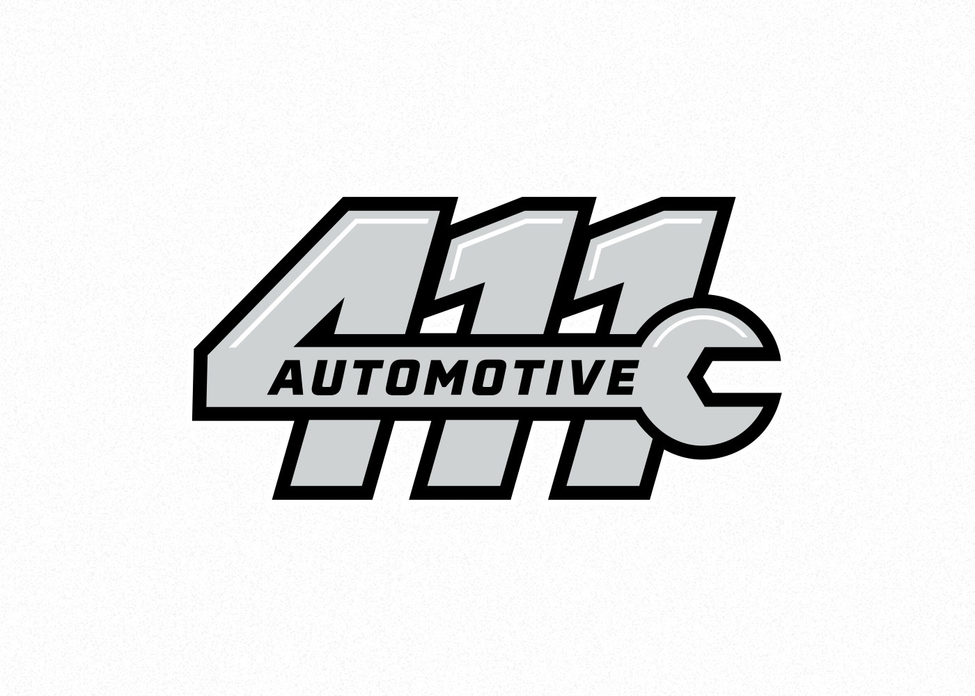
411 Automotive - Designed to convey motion and efficiency, reinforcing 411 Automotive’s promise to get customers back on the road quickly. The mark features a wrench to clearly communicate service, intentionally avoiding car iconography to prevent confusion with a dealership.
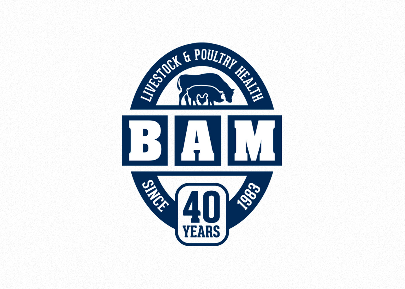
Bio Agri Mix 40th Anniversary Logo - Created with a strong agricultural tone, this anniversary logo keeps the existing brand identity front and centre. Supporting elements were designed to complement the core logo while celebrating the company’s 40-year milestone. Designed while working as a Graphic Designer at Brand Blvd.
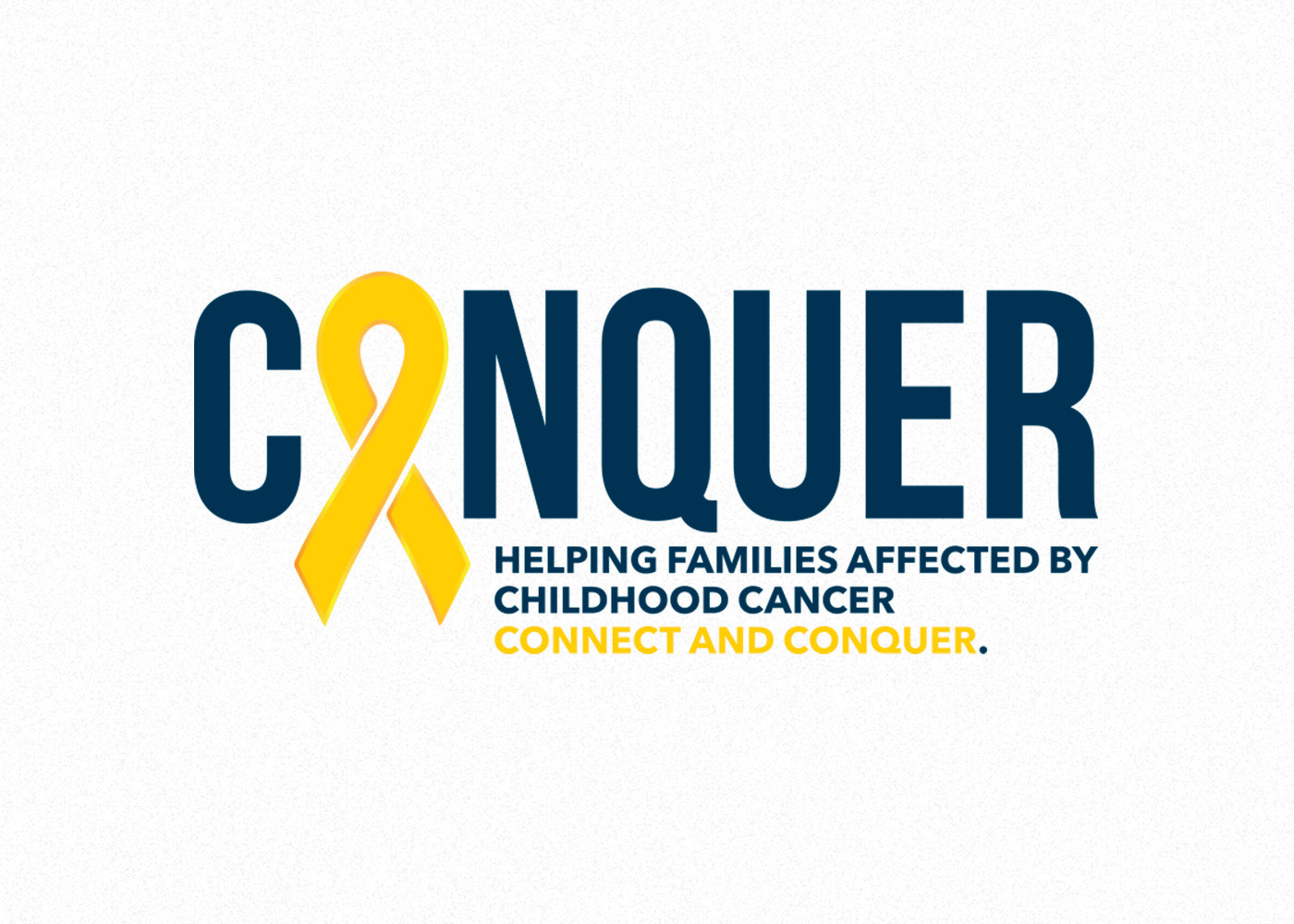
CONQUER - Developed for my third-year design thesis, this logo balances calm and resilience. A deep navy establishes a composed foundation, while gold accents—symbolic of childhood cancer awareness—add meaning and contrast. A clean sans serif typeface reinforces clarity and strength.
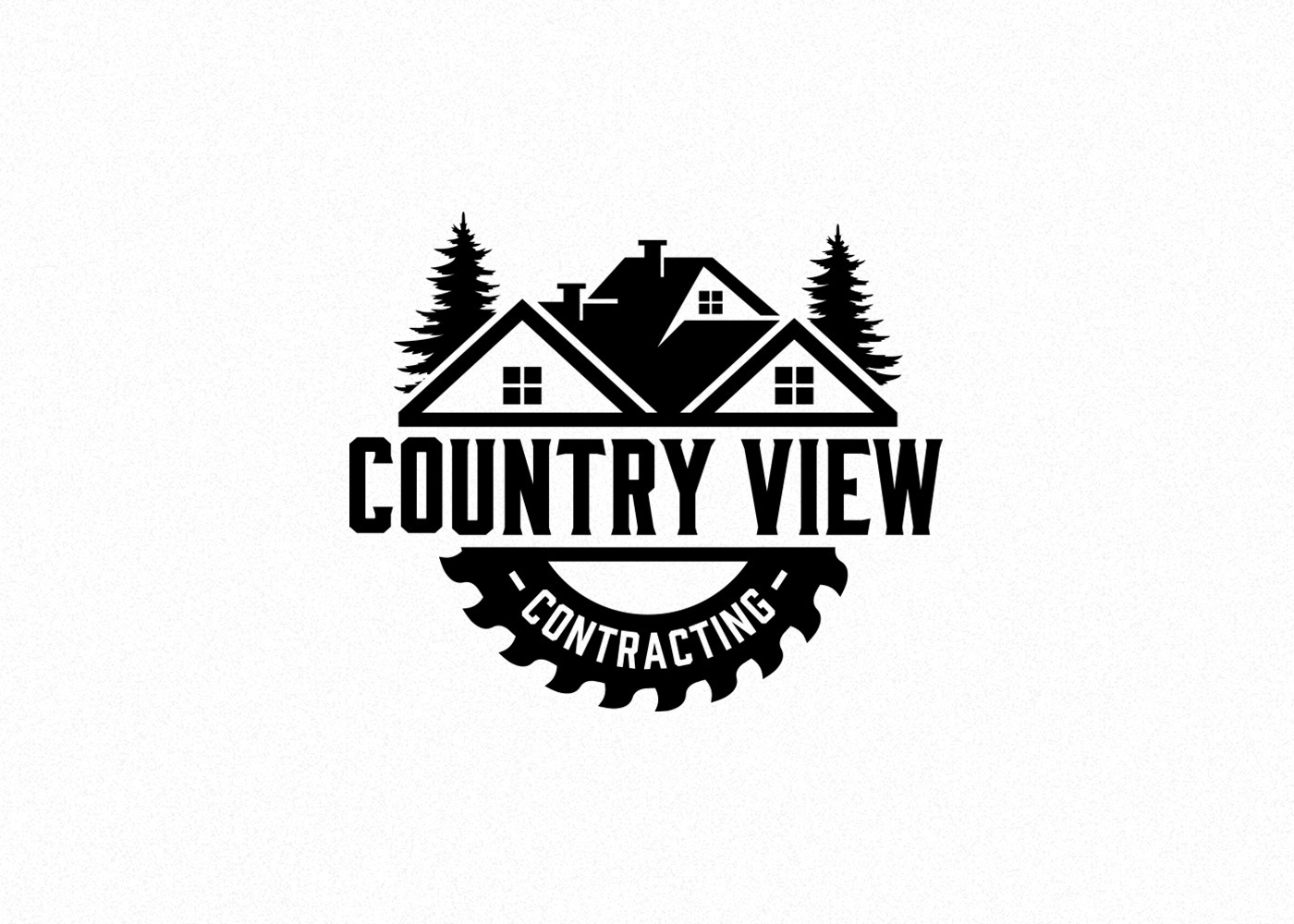
Country View Contracting - A refined evolution of the client’s original concept. The updated design integrates a saw blade, forest elements, and a home silhouette into a cohesive, professional mark while preserving the spirit of their initial vision.
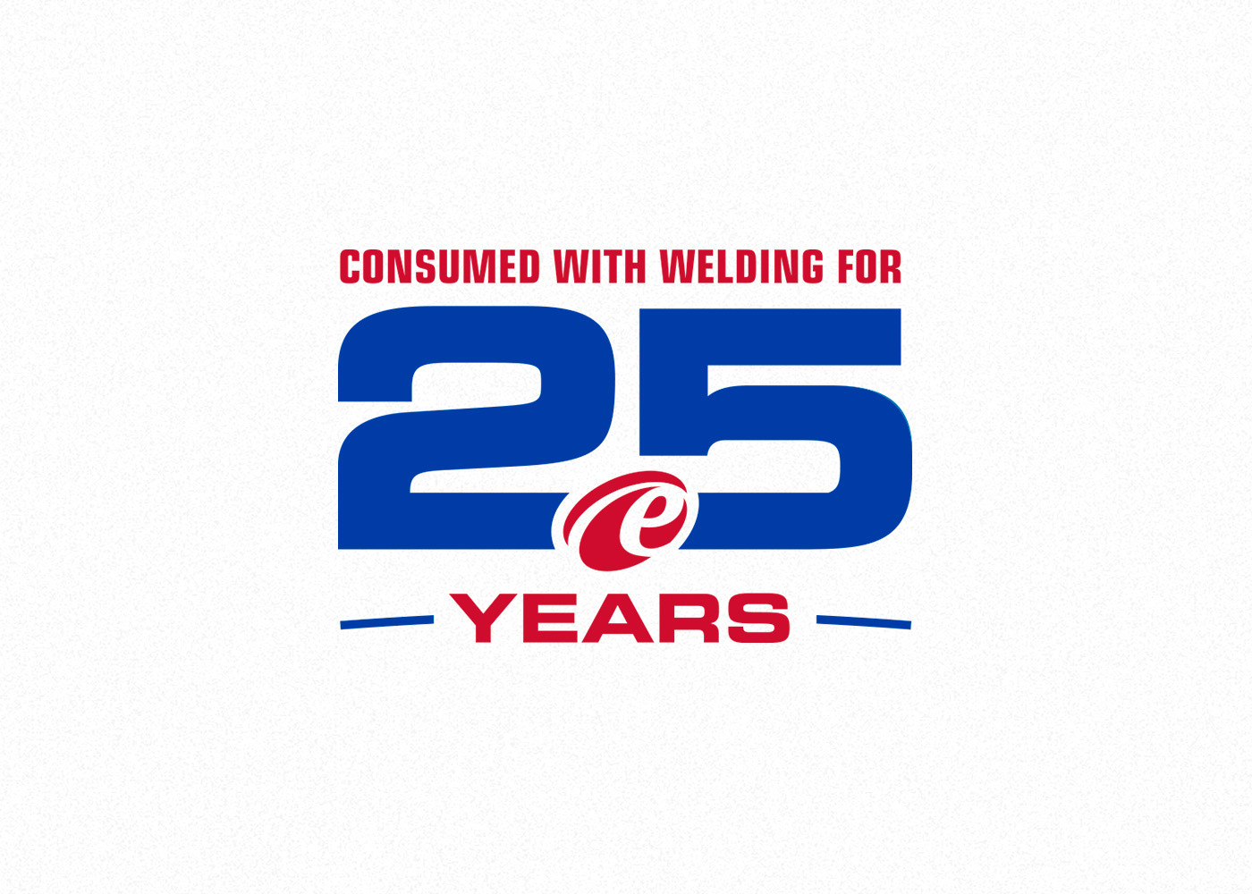
Exocor 25th Anniversary - Built to seamlessly extend the existing brand, this anniversary mark incorporates Exocor’s icon “welding” the number 25 together. The design also carries through the brand’s signature swoop, tying the milestone into their established visual language. Designed while working as a Graphic Designer at Brand Blvd.

Fort Erie Meteors Junior Hockey Club - This logo blends retro inspiration with modern execution. The crossbar of the “T” is stylized as a meteor streaking across the sky, while silver was reintroduced into the palette. Two stars pay homage to elements found in the team’s historical branding.
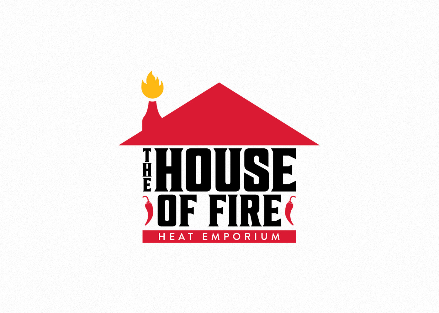
The House of Fire - A bold primary mark for a hot sauce distributor specializing in hard-to-find products. The logo forms a house silhouette, incorporating a hot sauce bottle as the chimney and “Heat Emporium” messaging to emphasize both theme and intensity.
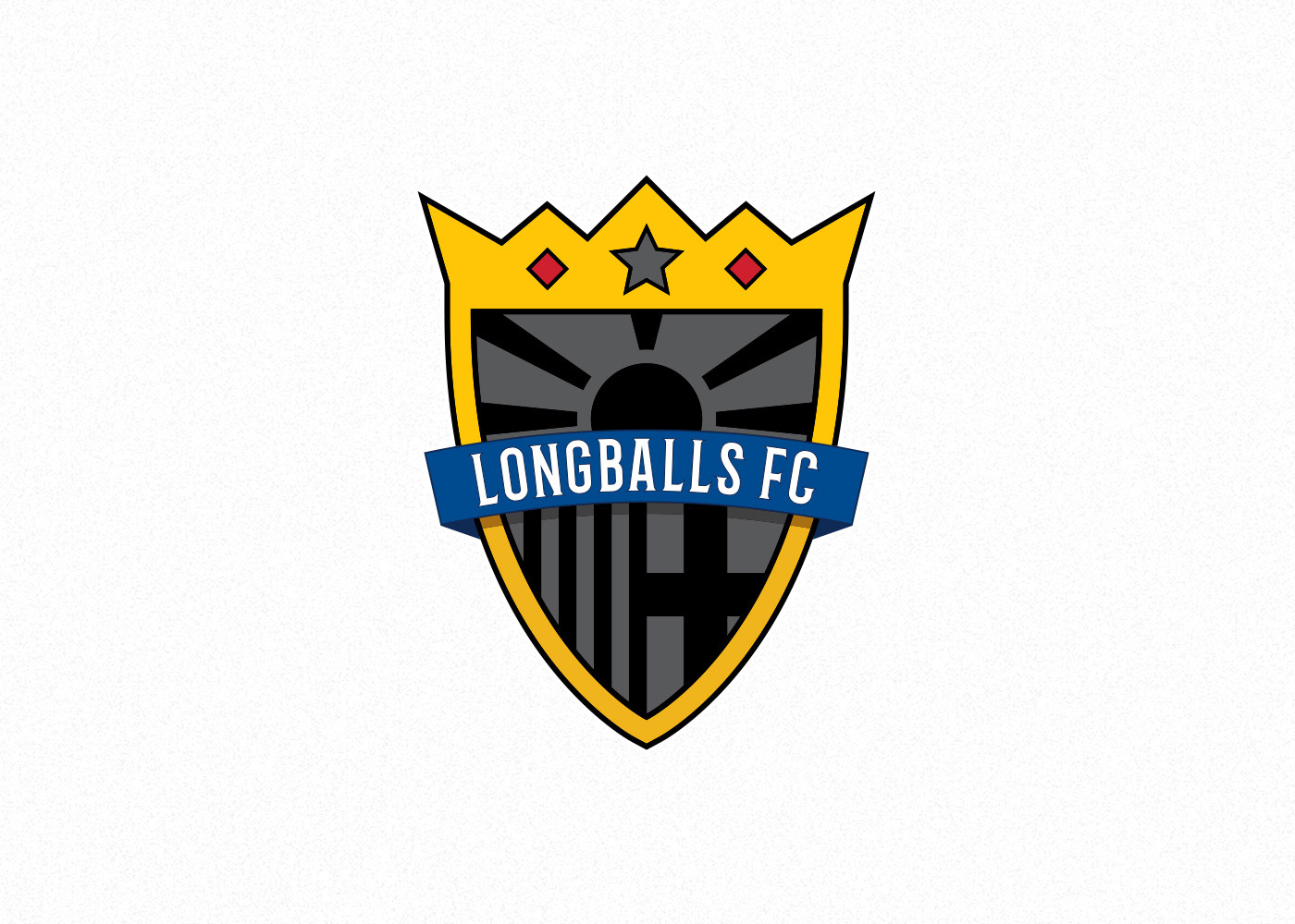
Longballs FC - A crest built to reflect the diverse nationalities of the team. The design incorporates global references, including the Vietnamese star, Macedonian rising sun, Albanian-inspired detailing, Italian blue, and a crown element drawn from an earlier version of the brand.
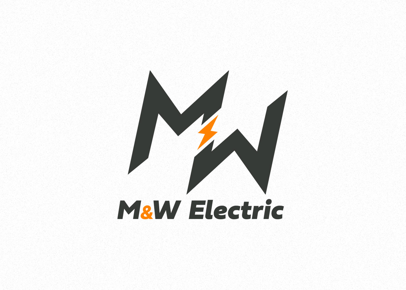
M&W Electric - A clean, professional identity with subtle industry cues. A lightning bolt is integrated into the design to reference electrical work without overpowering the brand. The final palette combines industrial grey with a vibrant orange for contrast and energy.
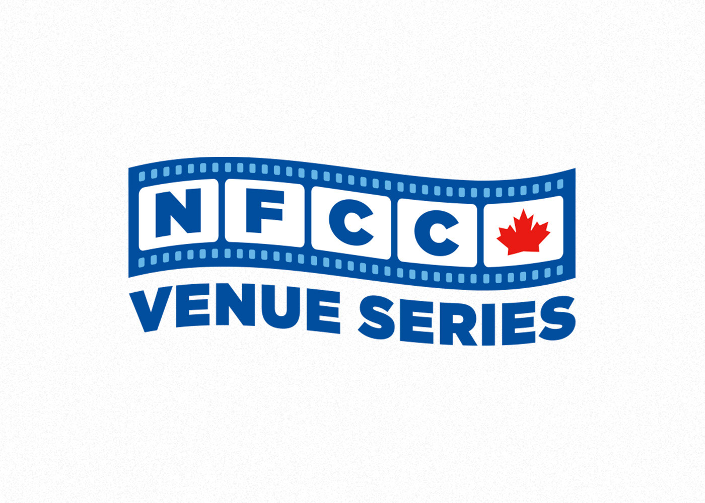
NFCC Venue Series - Designed as a dynamic film-strip-inspired identity, this mark shortens Niagara Falls Convention Centre to “NFCC.” A maple leaf highlights the venue's location, while a wave effect introduces motion suited to a video series. Designed while working as the Marketing Specialist at Niagara Falls Convention Centre.
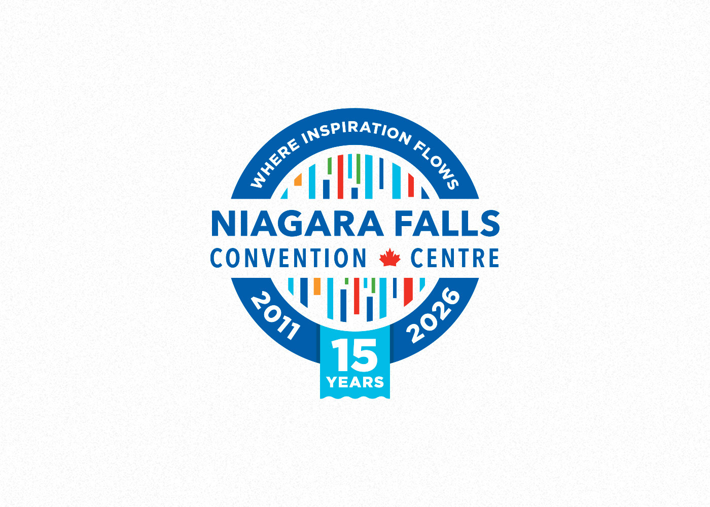
Niagara Falls Convention Centre - A commemorative mark celebrating 15 years of operation. The design incorporates the existing wordmark, shimmer icon, slogan, and operational dates to maintain consistency while marking the milestone. Designed while working as the Marketing Specialist at Niagara Falls Convention Centre.
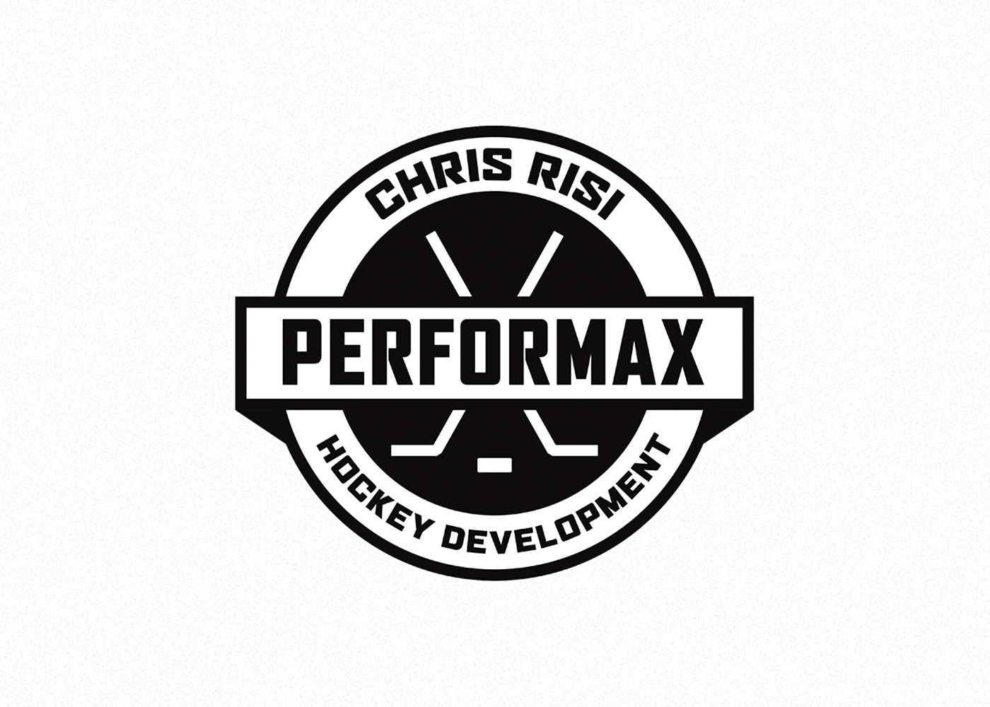
Performax Hockey Development - Focused on credibility and clarity, this identity highlights the brand name alongside the coach’s established reputation. The design reinforces the organization’s commitment to player development within hockey. Designed while working as the Graphic Design & Marketing Coordinator at Front Row Sports Excellence.
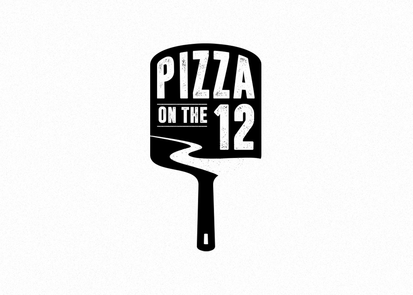
Pizza on the 12 - Inspired by tradition, this logo references an authentic pizza peel to reflect the restaurant’s Italian roots. The nearby 12 Mile Creek is subtly integrated into the design, grounding the brand in its local St. Catharines identity. Designed while working as a Graphic Designer at Brand Blvd.
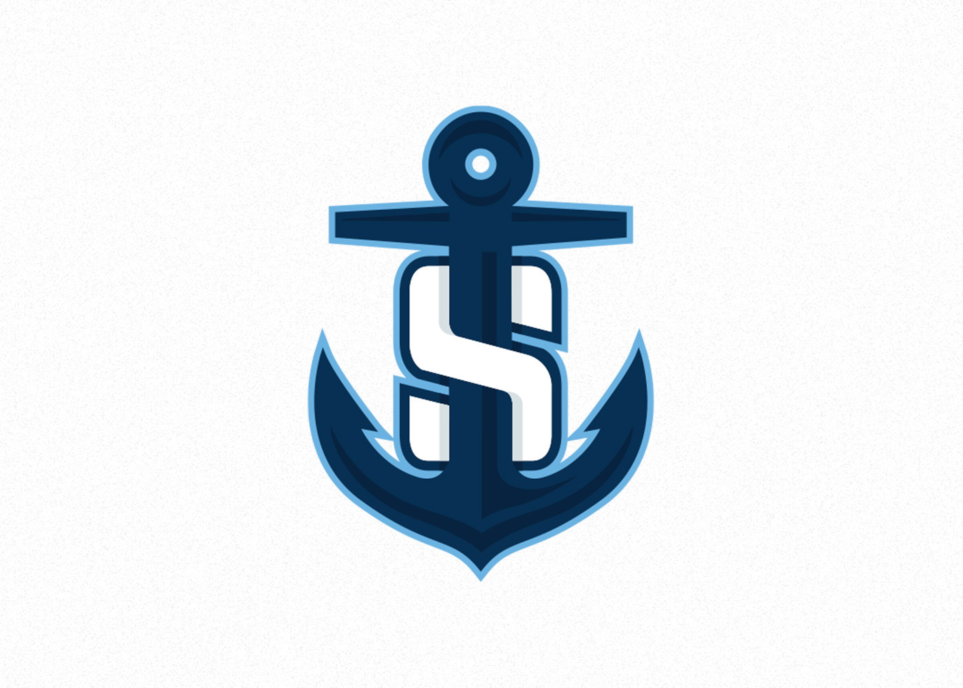
Port Colborne Sailors Junior Hockey Club - A bold, beveled anchor wrapped within a strong “S” creates a distinctive and memorable identity. The colour palette draws directly from Port Colborne’s rich nautical heritage, setting the team apart visually within the Greater Ontario Hockey League.
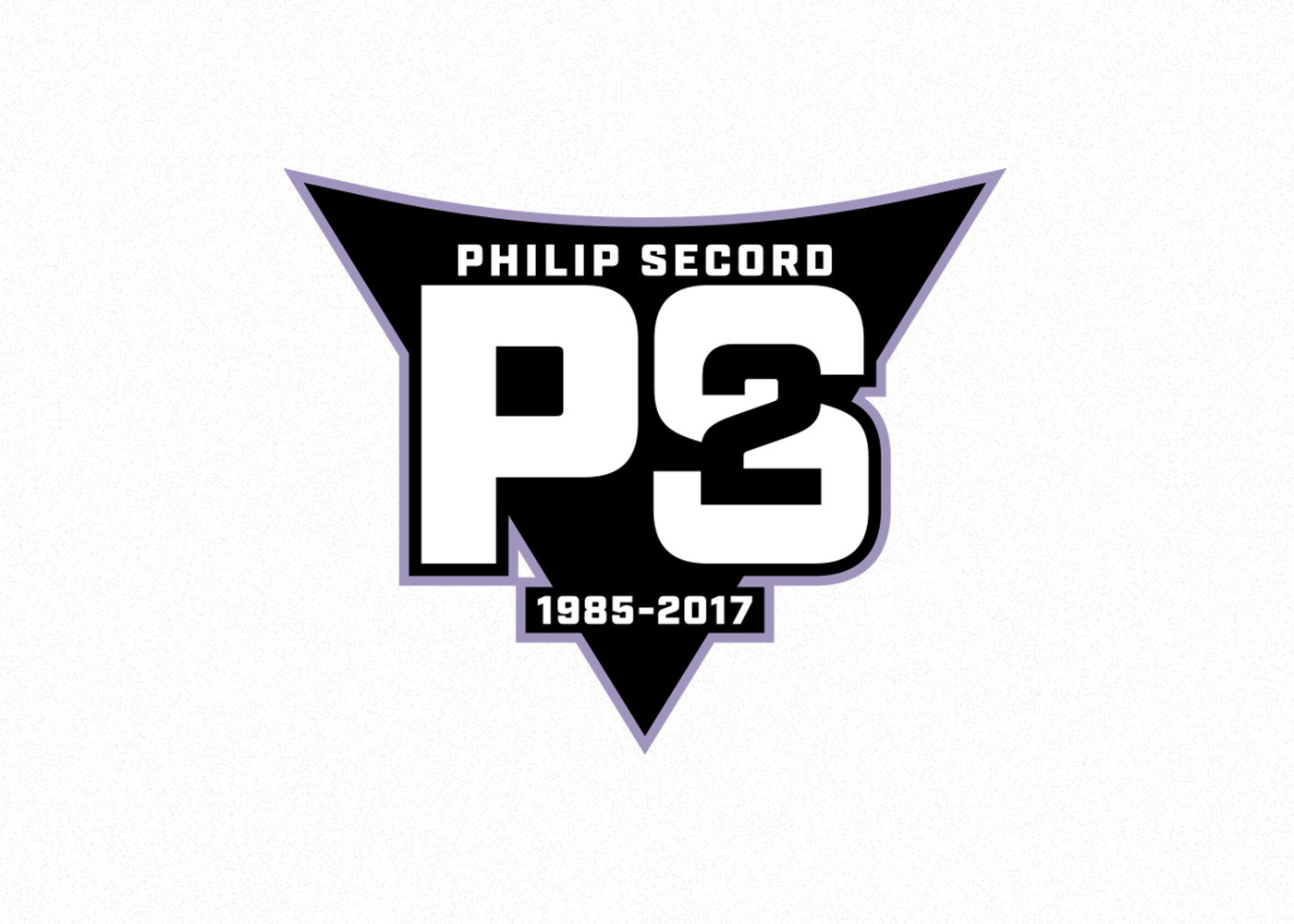
Philip Secord Memorial Patch - Designed to honour the life of Philip Secord, this patch thoughtfully incorporates personal elements that reflect his story. The triangular form references the San Jose Sharks logo—his favourite team—while his initials, the number 2, and his lifespan are integrated to create a meaningful and lasting tribute. Designed while working as the Graphic Design & Marketing Coordinator at Front Row Sports Excellence.
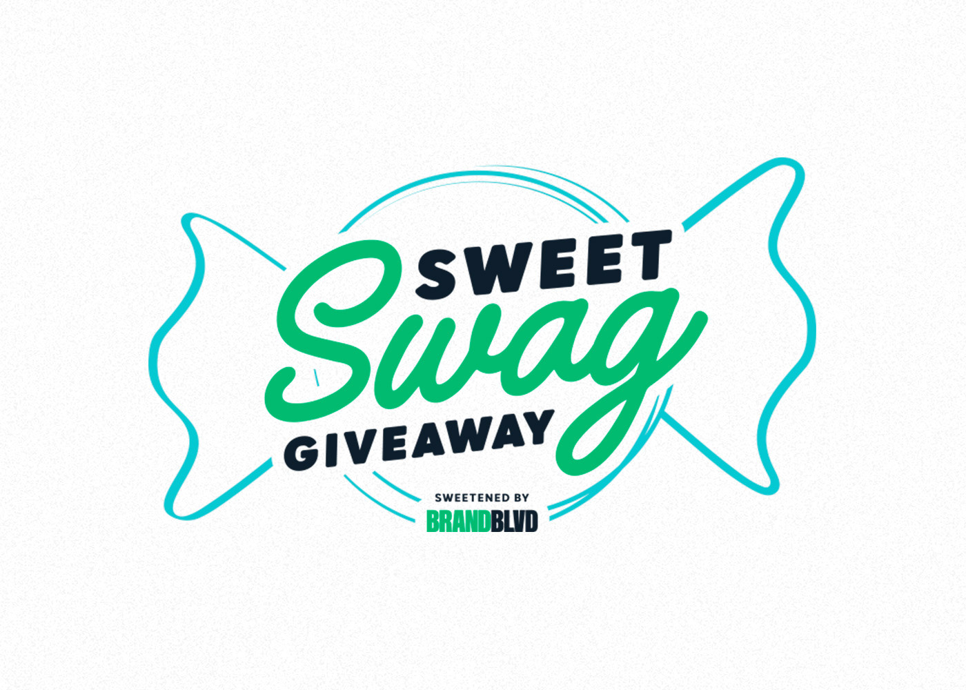
Sweet Swag Giveaway - Created for Brand Blvd, this logo supports a custom candy giveaway campaign. The design incorporates the brand’s colour palette, a stylized candy wrapper, and a custom type treatment to deliver a fun, energetic, and cohesive promotional identity. Designed while working as a Graphic Designer at Brand Blvd.