
PORT COLBORNE SAILORS Junior Hockey Club
Client Background
The Port Colborne Sailors Junior Hockey Club are a member of the Greater OntarioHockey League (GOHL), competing in the Eastern Conference. Originally established as the Thorold Blackhawks, the organization relocated to Port Colborne ahead of the 2023–24 season following a temporary move during arena renovations. The transition marked the end of over 60 years of junior hockey in Thorold and the beginning of a new chapter in the lake-side community.
Now based out of the Vale Health & Wellness Centre, the Sailors have embraced a brand identity inspired by Port Colborne’s rich maritime heritage.
Now based out of the Vale Health & Wellness Centre, the Sailors have embraced a brand identity inspired by Port Colborne’s rich maritime heritage.
Strategy & Outcome
In 2024, I was commissioned by the Port Colborne Sailors to develop a new primary logo for the franchise. After collaborating closely with team management and exploring a range of concepts, we landed on a mark featuring an anchor wrapped in an “S,” enhanced with beveled shading and a nautical-inspired colour palette to reflect the city’s marine identity.
Following the finalization of the logo, I extended the brand across a range of supporting collateral, including a trade show tent, folding pocket schedule, and beer can design. Each piece was created to maintain consistency with the core identity while helping strengthen the team’s presence within the community.
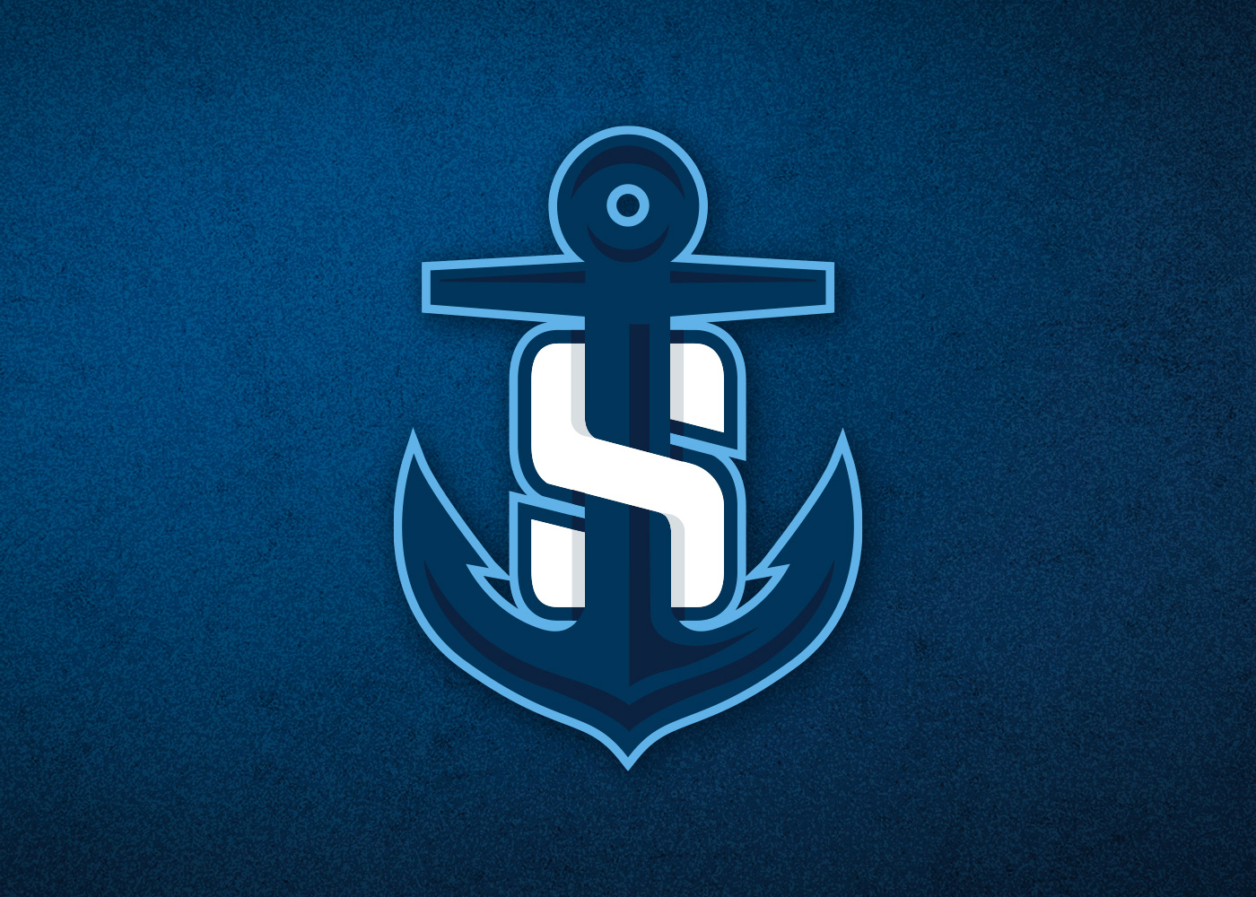
Port Colborne Sailors Junior Hockey Club Logo Design - A bold, beveled anchor wrapped within a strong “S” creates a distinctive and memorable identity. The colour palette draws directly from Port Colborne’s rich nautical heritage, setting the team apart visually within the Greater Ontario Hockey League.
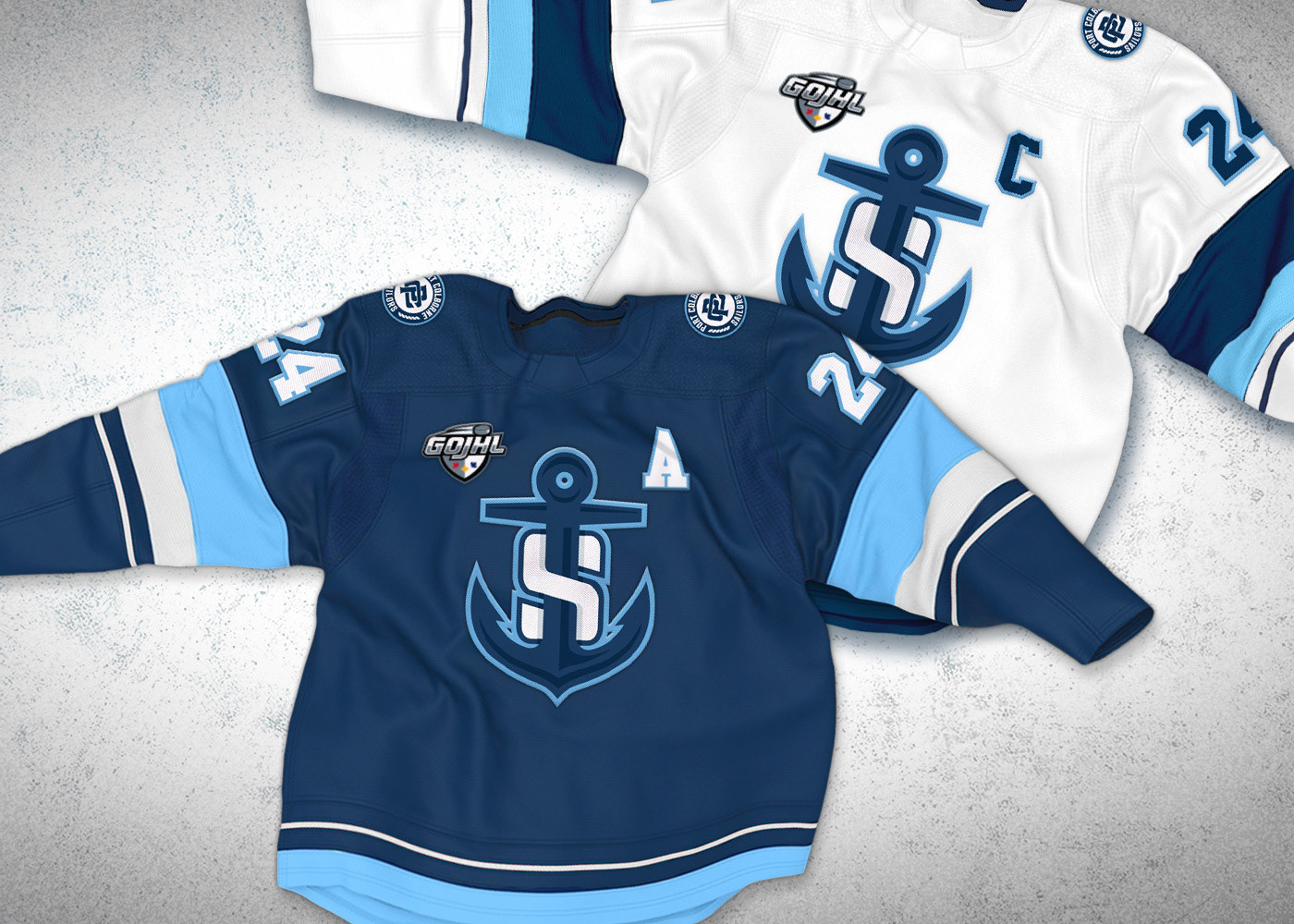
Port Colborne Sailors jerseys, influenced by the Seattle Kraken's jersey pattern.
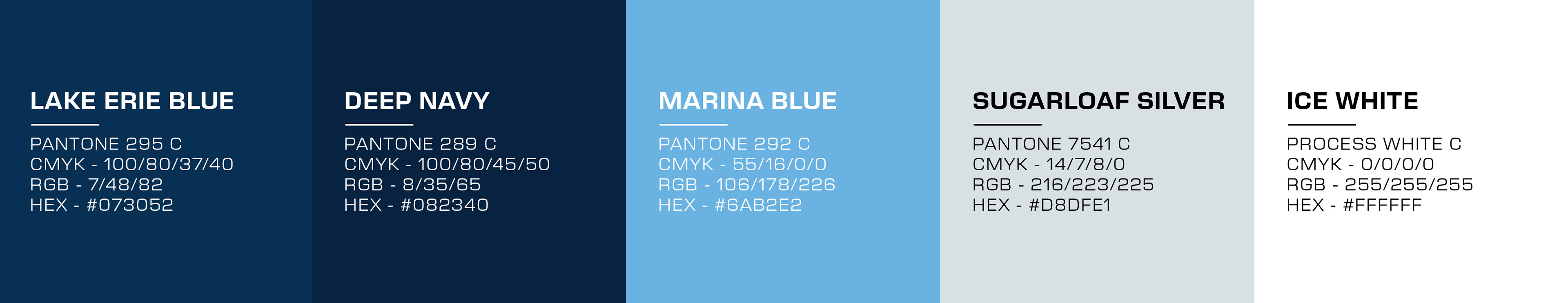
Colour profile selected to be unique to the Greater Ontario Hockey League, and represent Port Colborne's heritage.
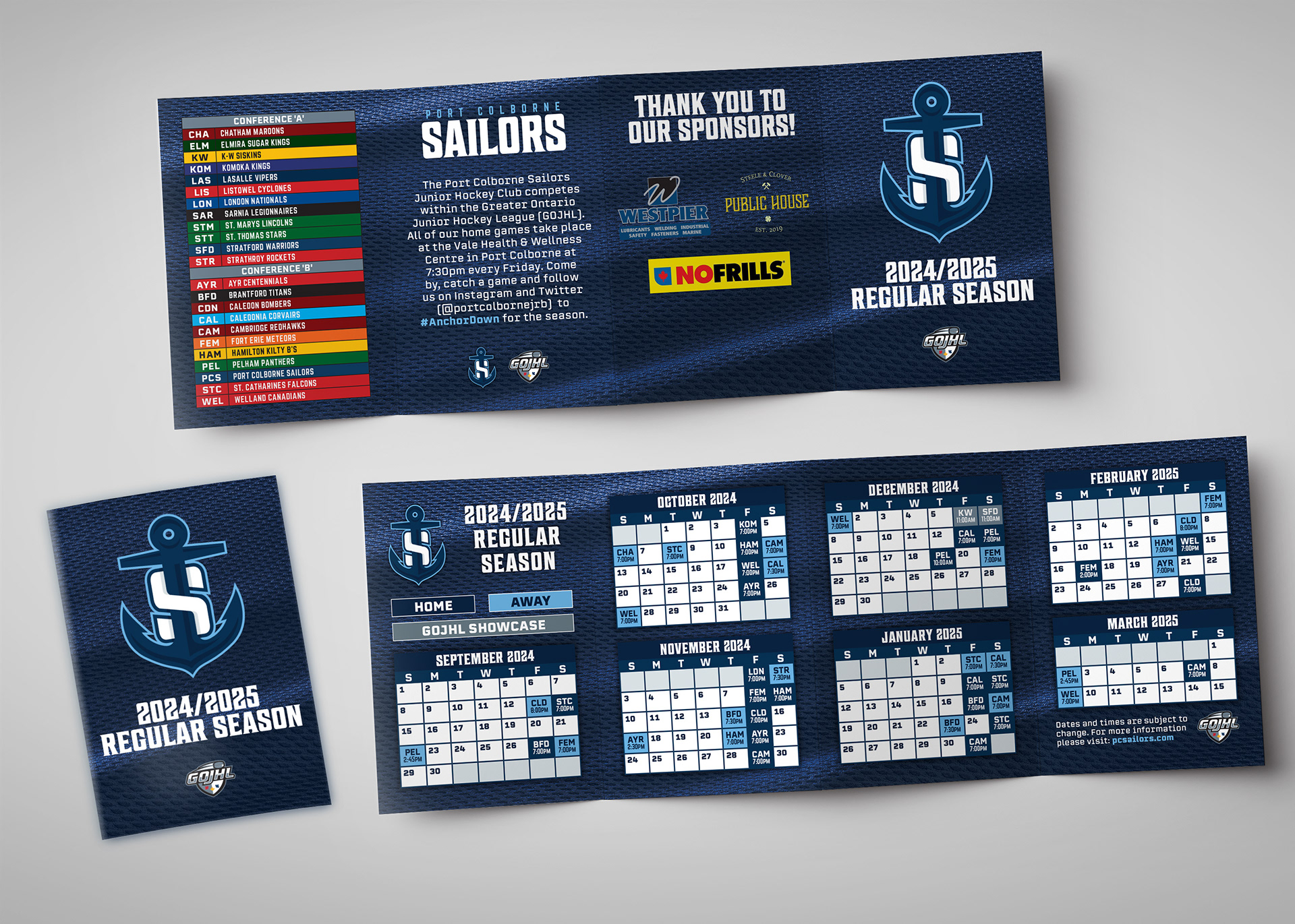
Folding pocket schedule.
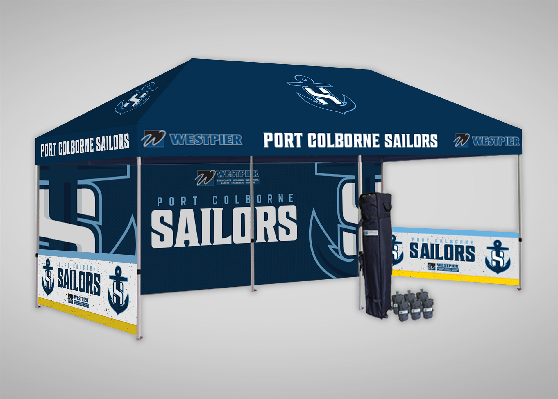
20ft wide x 10ft high community activation tent.
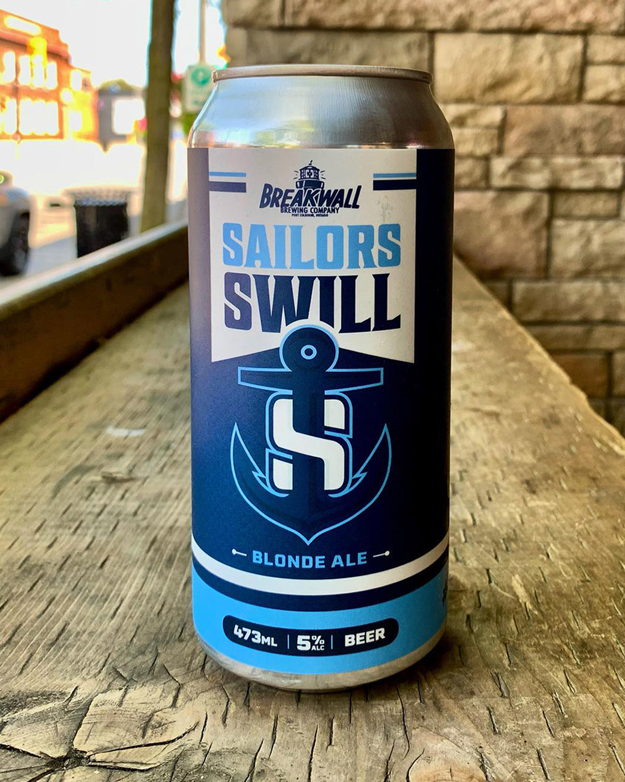
Sailors Swill beer can design.
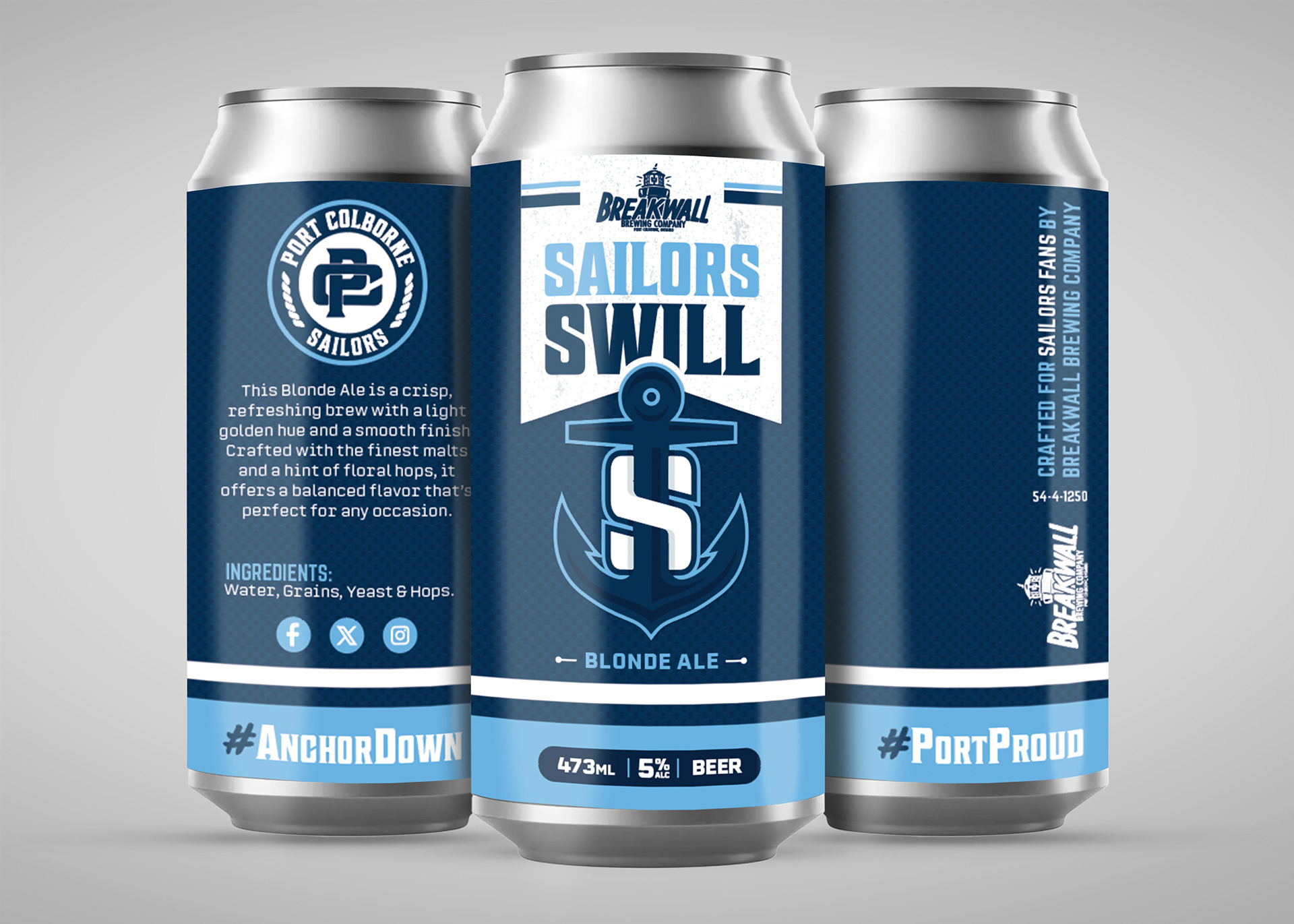
Sailors Swill beer can rendering.