
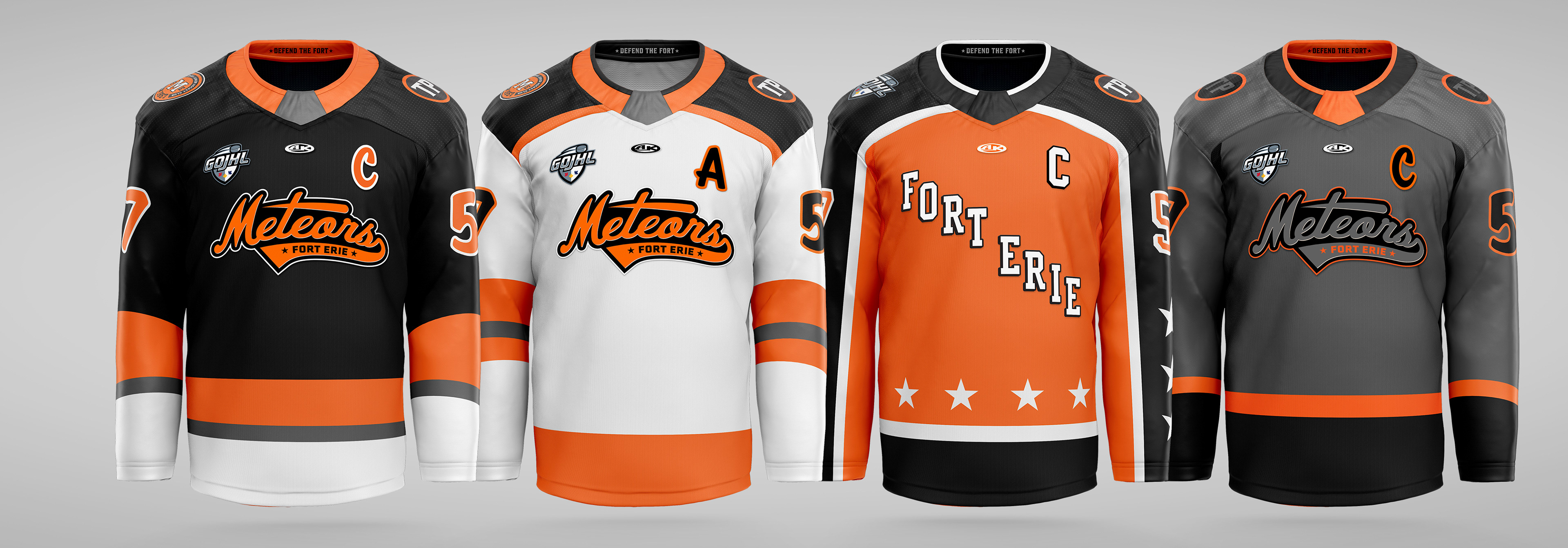
Primary logo design for the Fort Erie Meteors Junior Hockey Club. This logo was created as a retro wordmark with a modern twist, featuring an abstract meteor as the crossbar of the "t", adding a touch of silver, and carrying over stars that could be found in previous logos throughout the Meteors storied history.
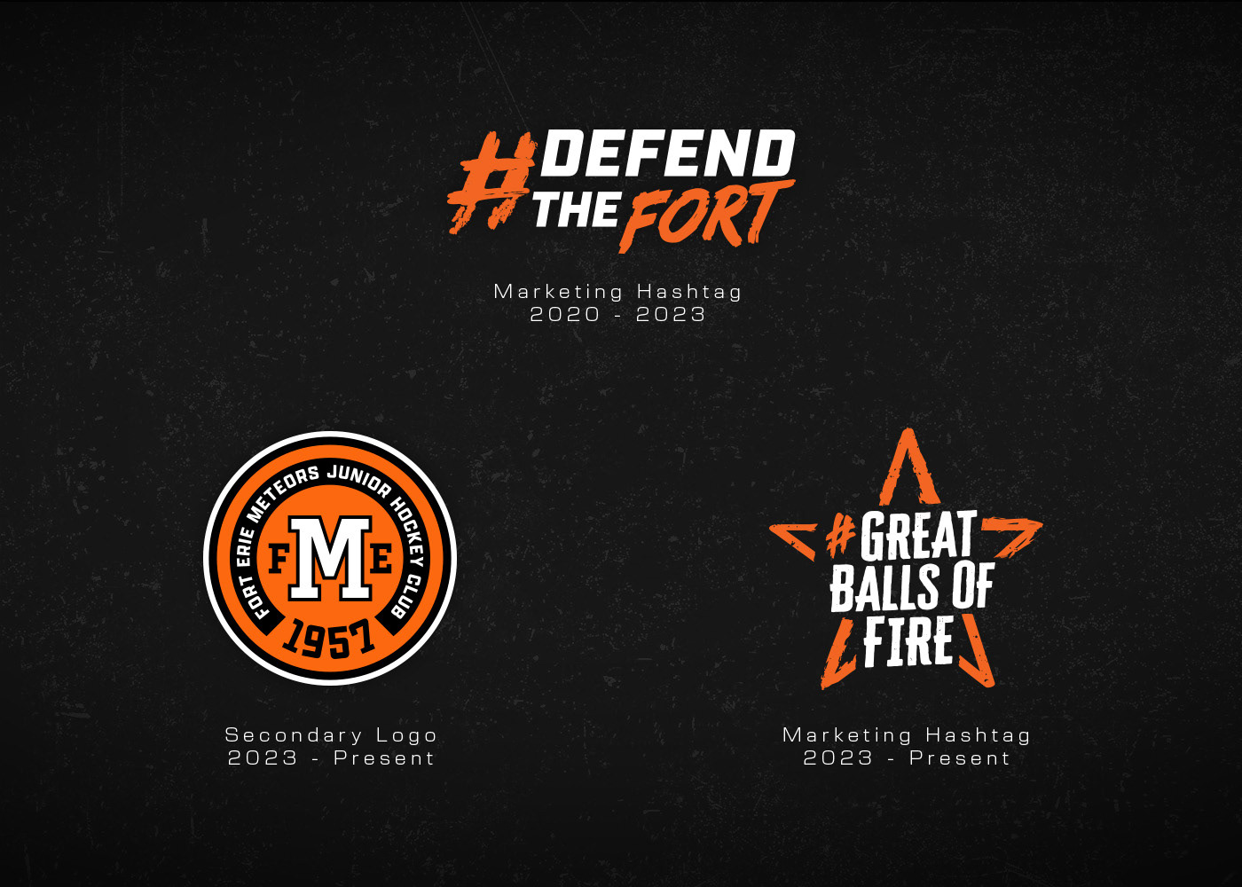
Marketing hashtags used on digital and print collateral, along with a secondary logo used on merchandise and the right shoulder of the jerseys.
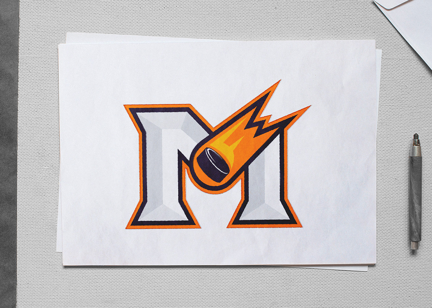
Conceptual logo development for the Fort Erie Meteors, blending the serif "M" from their previous logo with a modern, bevelled twist. The "Meteor" is a hockey puck burning in the atmosphere with a stylized "FE" in the trail.
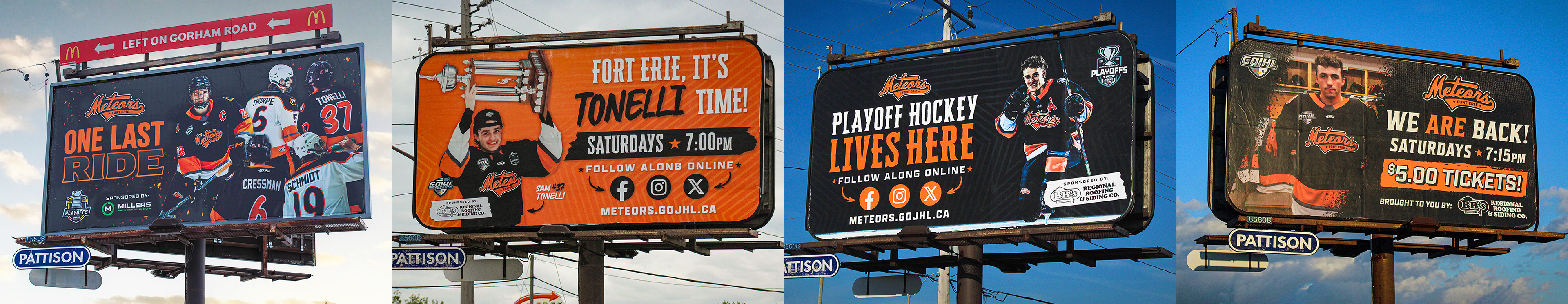
Collection of billboards I have designed over the years.
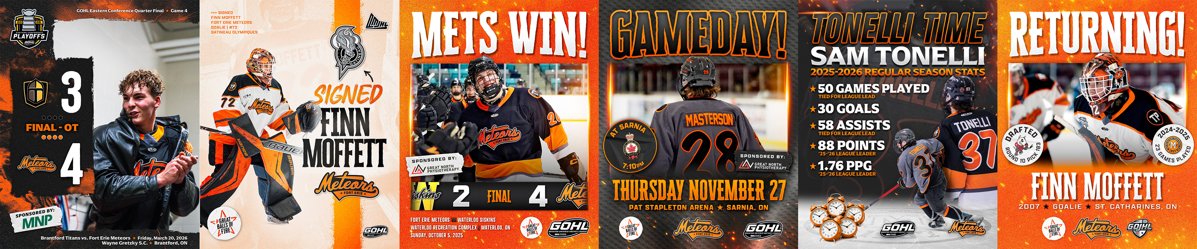
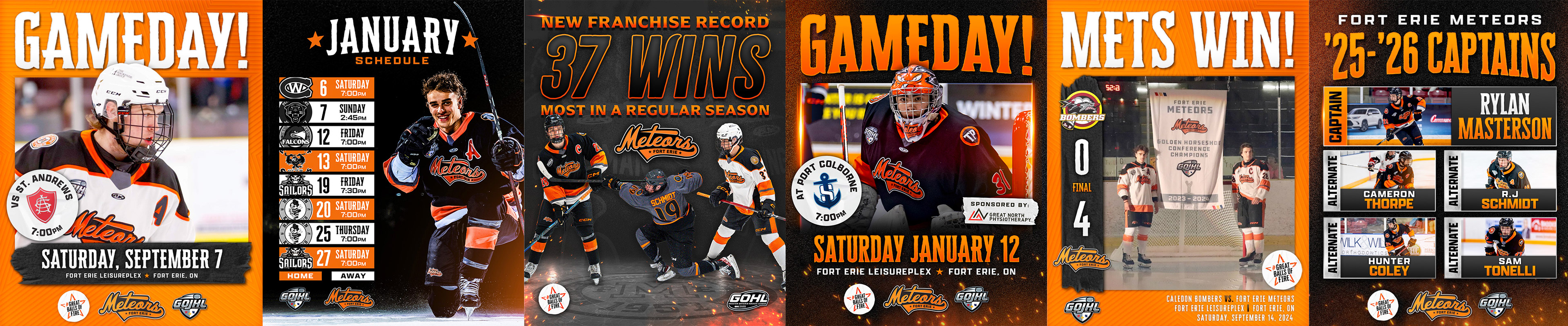
Collection of social media graphics and templates that I have created over the years. All designed to have a cohesive look throughout the gameday, final score and playoff run.
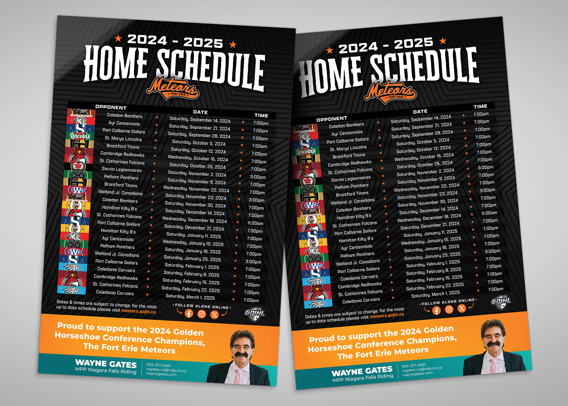
2024-2025 18" x 24" home schedule poster, sponsored by MPP Wayne Gates.
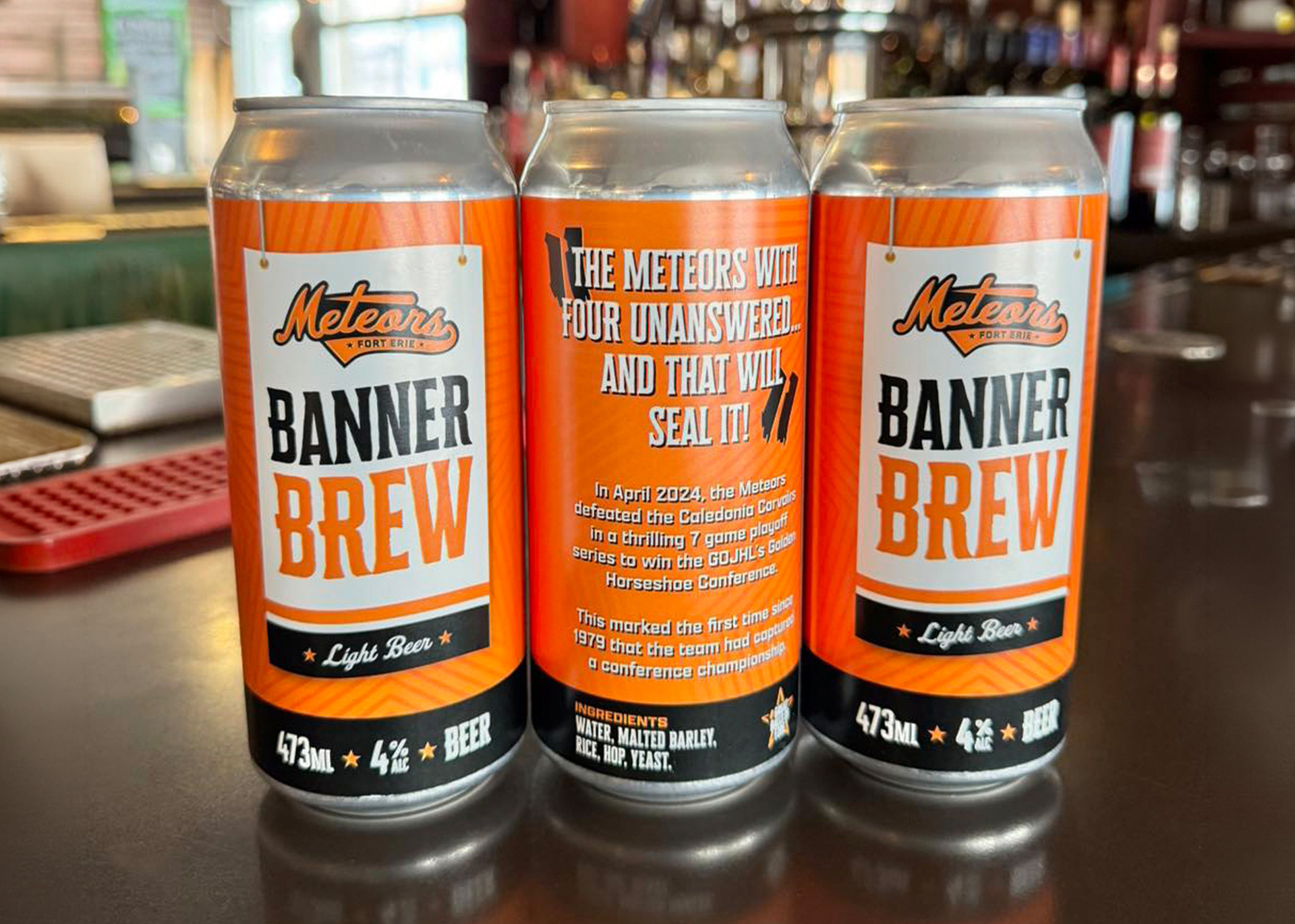
Banner Brew - Beer can design to celebrate the 2024 Golden Horseshoe Conference championship. Beer produced through Brimstone Brewery.
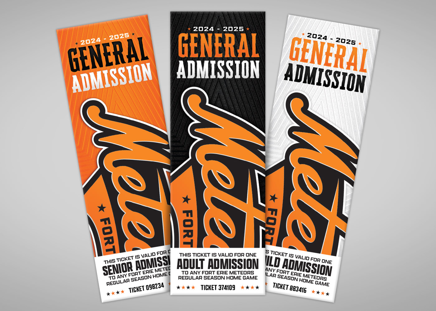
General admission ticket design, colour coded based on demographic and designed to leave space for ticket numbering.
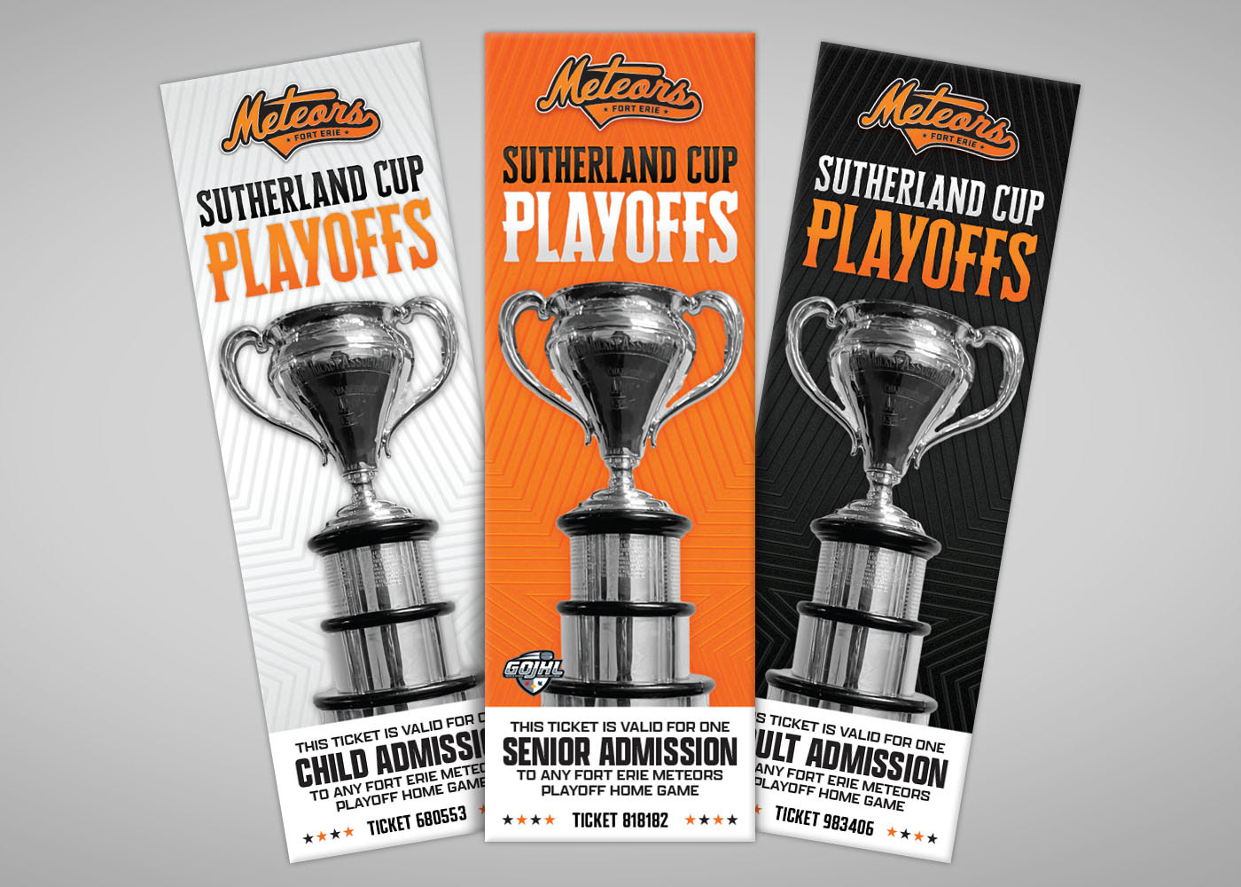
Sutherland Cup Playoffs ticket design, colour coded based on demographic and designed to leave space for ticket numbering.
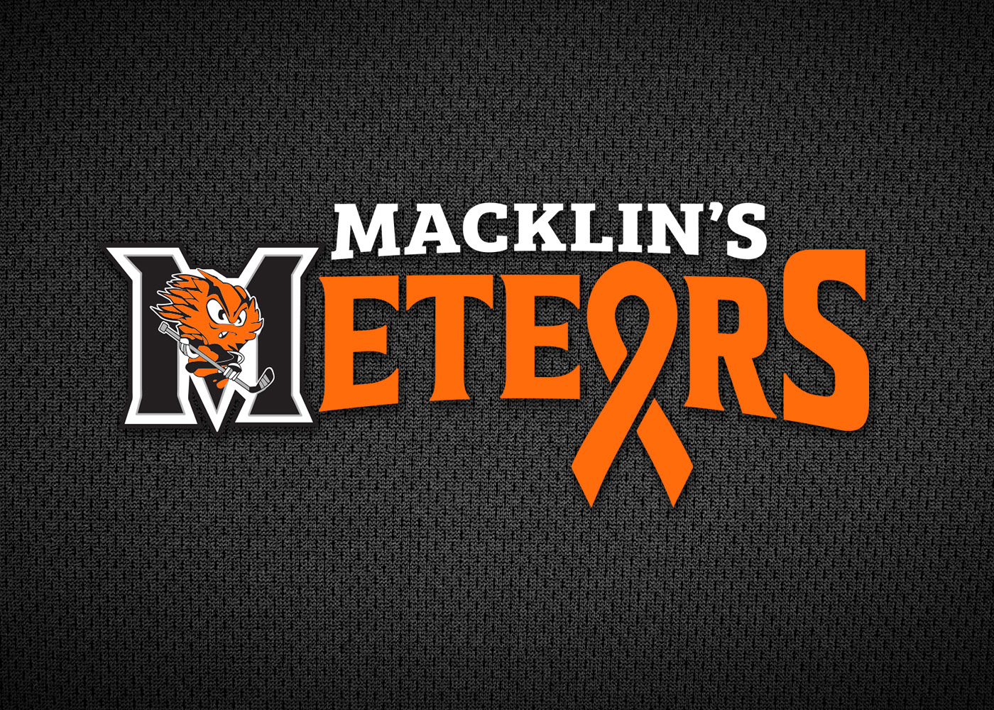
Logo design for "Macklin's Meteors" night. A fundraising effort for the family of Macklin Stoner, a young child from Fort Erie that was battling cancer.
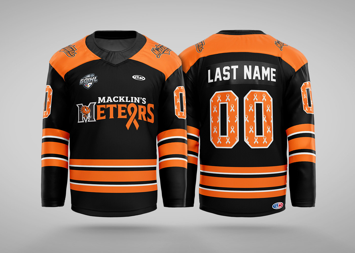
Jersey design for "Macklin's Meteors" night, game worn sweaters were auctioned off after the game with the grand total from the campaign reaching $25,000.